When your visitor quota runs out, every experiment stops. No overage. No grace period.
That is not a billing detail. It is the line between experiments running and going dark. And customers could not see that line.
| Product | VWO by Wingify — A/B testing & experimentation |
| Scale | 3,000+ brands, 90+ countries, ~$50M ARR |
| My role | Competitive research, billing logic, state model, core screens |
| Team | 1 PM, me, 1 design manager, 1 UI/UX, 1 QA, eng pod |
| Status | Shipped — all phases live |
The problem
The most important number in the product — how much quota is left — was three clicks deep, next to an unrelated activity timeline, shown as raw text.
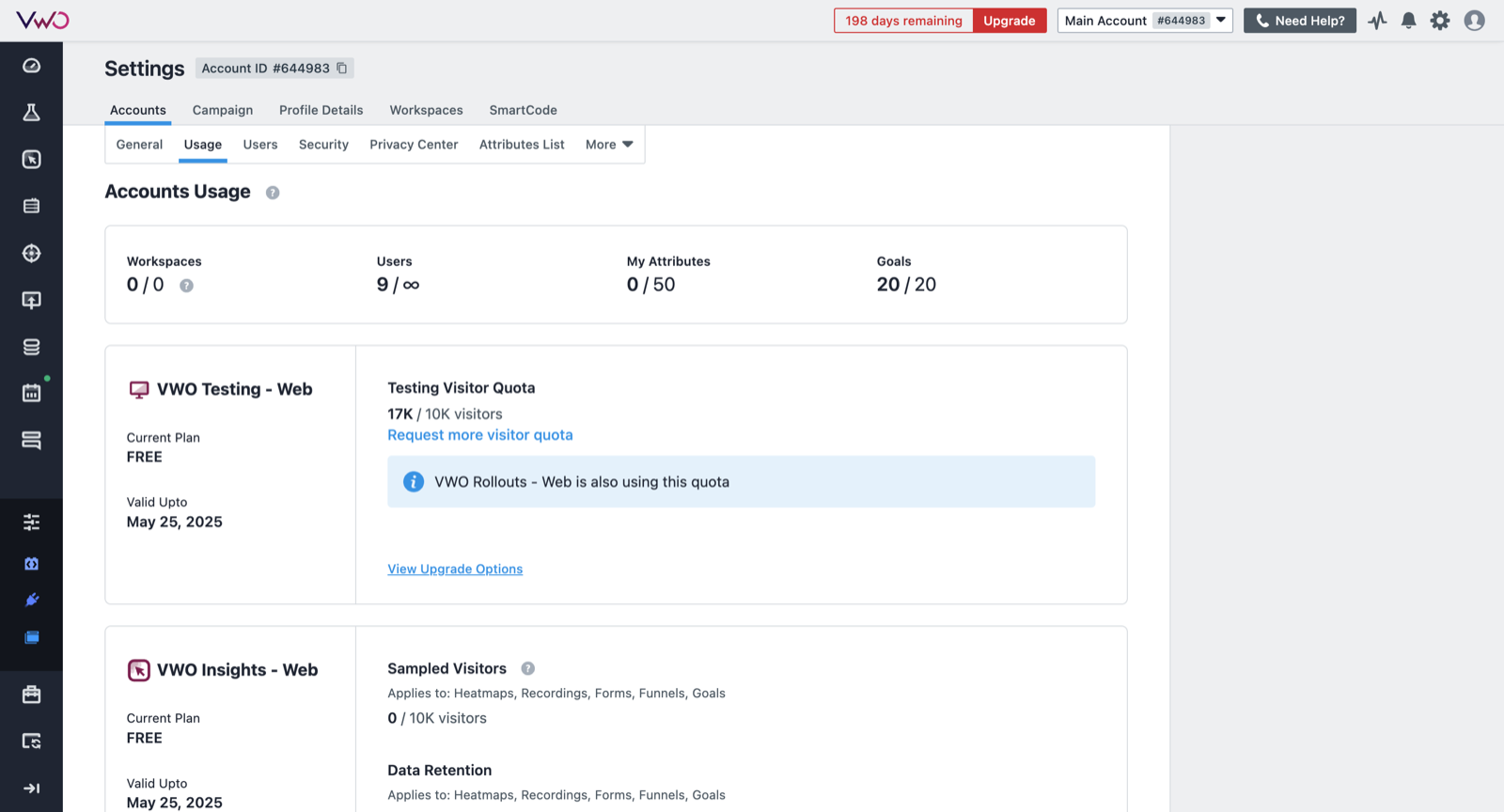
17K / 10K visitors. Already over. No forecast, no warning, no way to see what ate it.
Our PM handed me a PRD and a document of every billing request support had received. Read as a list they look like feature requests. Read together they are one question, asked over and over:
| What the customer said | What they actually needed |
|---|---|
| "My dashboard says I used 18,000 visitors. My test ran on 1.18 million. Which is right?" | Show me how you count. |
| "Two of our teams share one quota. One team used it all. The other can't run anything now." | Show me who spent it. |
| "I download four invoices every month just to find the newest one." | Give invoices a name I can read. |
| "Can we pick our own date range instead of emailing you for it?" | Stop making me ask a human. |
Take the first one. Both numbers were right. VWO counts a person once per billing cycle even if they land in five different tests — so 1.18 million visits really were 18,000 billable people.
Sensible rule. It just appeared nowhere on screen. So the customer sees two numbers that don’t match, assumes something is broken, and opens a ticket. Every row in that table is the same shape: the product knew the answer and never said it out loud.
That reframed it for me. I was not designing a settings page. I was designing the thing that makes usage-based pricing survivable for the person paying for it.
Audience
- Experimentation lead — needs warning before quota kills a live test.
- Account admin — needs per-workspace breakdowns to allocate quota fairly.
- Finance — needs readable invoices and the monthly cost, in one place.
Each one is a person who wrote one of those tickets.
Constraints
“Next renewal date” had six different correct answers.
Three cycles run independently — contract term, quota cycle, billing cycle — and the billing month is anchored to the contract date, not the calendar.
| Case | Contract | Quota | Billing | What the screen must show |
|---|---|---|---|---|
| 1 | 12m | 12m | 12m | One date. |
| 2 | 12m | 6m | 12m | Auto-pay changes the label. |
| 3 | 12m | 6m | 3m | Renewal ≠ invoice ≠ quota reset. |
| 4 | Until cancelled | 12m | 12m | No end date exists. |
| 5 | Until cancelled | 12m | 1m | Twelve invoices per quota cycle. |
| 6 | Organic self-serve signup | No contract to anchor to. | ||
Design the screens first and half of them confidently show the wrong date. So I built the matrix before I drew anything.
What I did
Every state an account can be in
Not one status — four independent tracks running at once.
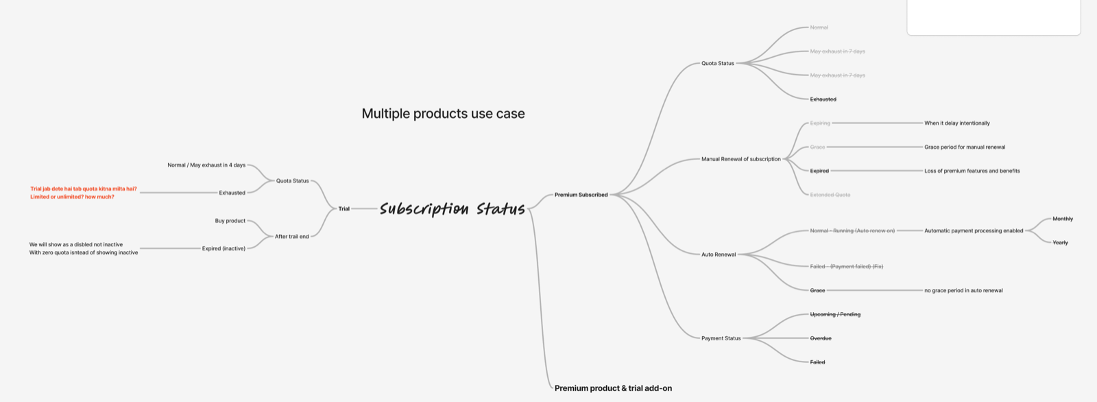
Two details mattered more than they look:
Auto-renewal has no grace period. Manual renewal does. So “grace” means two different things, and the screen has to say which.
We stopped calling expired trials “inactive.” Inactive sounds like something you switched off. Disabled with zero quota tells you what happened and what to do. One word, one fewer ticket.
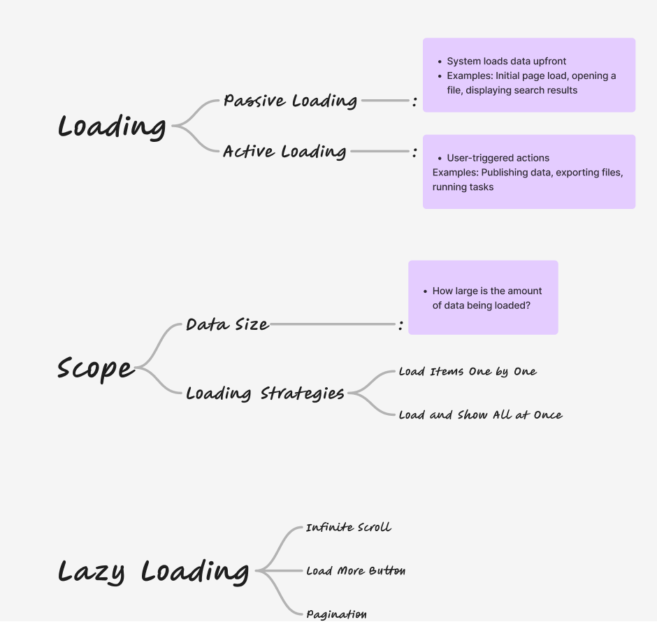
I split loading into passive (system-initiated, can be a skeleton) and active (user asked for it, must confirm something is happening). The invoices table got pagination out of this — finance needs to jump to one invoice, not scroll.
From flow to final
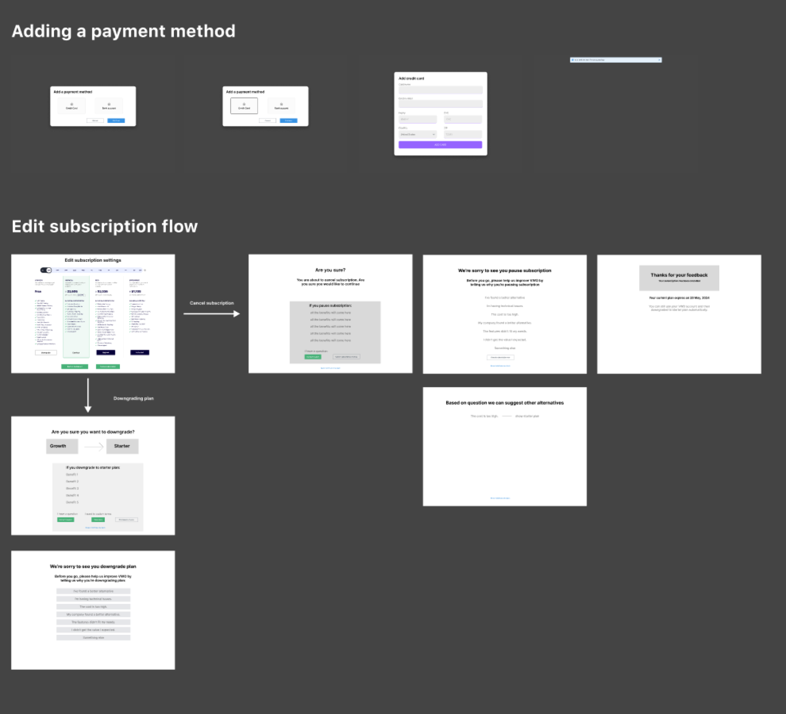
Flows first — cancel, pause and downgrade paths, before any visual design.
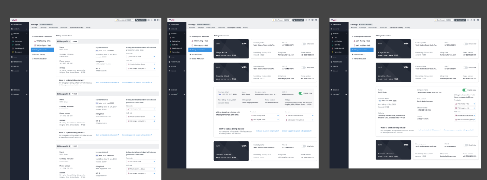
Iterating on billing profiles until multiple cards, products and addresses fit one readable layout.
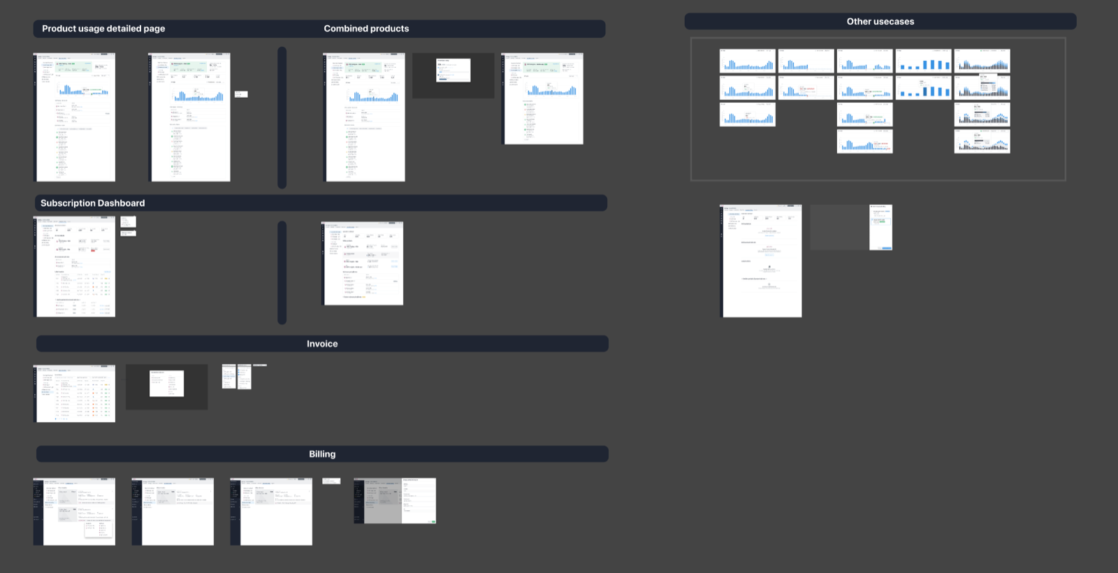
The final set — product usage, subscription dashboard, invoices, billing.
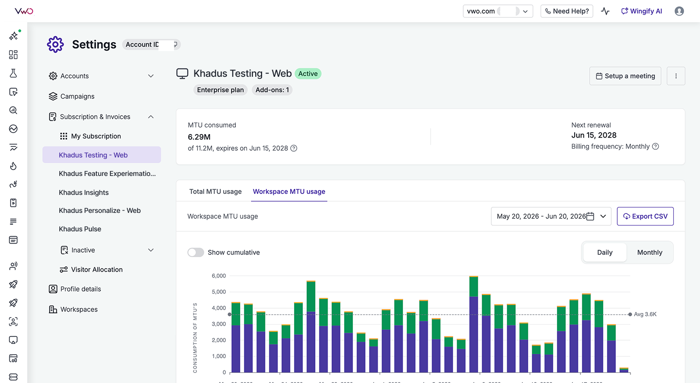
Shipped. A product card now reads like a sentence: 17K / 2.01M, auto-renews Aug 1, 5 days left.
I did not run the usability sessions — someone else did. My job was the synthesis: clustering raw observations into themes and separating real problems from one person’s preference. The copy and the forecast visualisation both changed because of it.
Outcomes
Quota-related support tickets went to zero.
Not fewer. None. The queue that started this project — customers asking a human to read a number back to them — stopped.
Every row below used to be a ticket.
| Before | After | |
|---|---|---|
| Find your quota | 3 clicks, buried in Accounts | Its own section in the nav |
| What it told you | "17K / 10K visitors" | Consumed, expiry, renewal, days left |
| Usage by workspace | Email support and wait | Daily graph, 180-day range, export CSV |
| Finding the latest invoice | Download several and check | Readable IDs and statuses |
| Quota about to run out | You find out when tests stop | A warning state, before it happens |
| The old Usage page | — | Deleted. It now redirects. |
All of it is live
The subscription hub, per-product pages, the MTU usage graph, the invoice list, billing profiles, transaction history, the subscription timeline, in-app Salesforce invoices, monthly-to-annual switching, and usage forecasting.
Plus the unglamorous half: the old Usage and Billing pages retired, consistent graph colours across products and workspaces, a 180-day range, exact date on hover, and corrected combined-quota CSVs.
Three things I would carry forward
- Design the logic before the layout. The matrix and the state map were the design.
- Read the raw input, not just the brief. Every screen traces to a sentence a customer actually wrote.
- Deciding what not to ship is senior work. The highest-impact ticket on a 29-story board was deleting two pages.
Thank you for reading my case study.